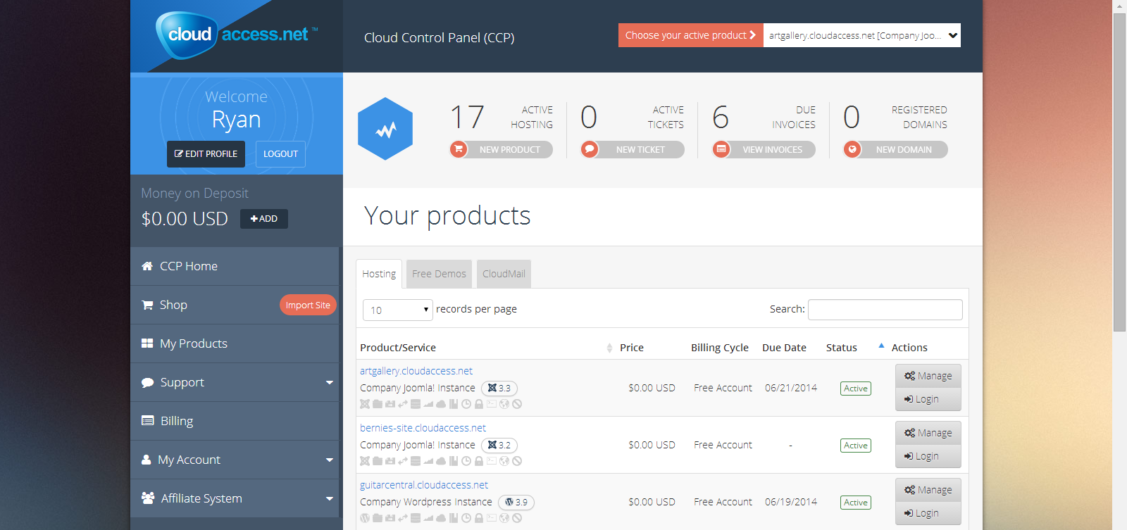
The Evolution of the CCP: Our Design Process
The Cloud Control Panel, or the CCP, is an easy-to-use interface used to manage each website hosted with CloudAccess.net. We recently redesigned the entire CCP and this blog describes the process we went through and offers a little history of one of the most important pieces of our platform.
In the beginning, the CCP was actually a custom Joomla component we built and pre-installed in Joomla sites that were launched through our platform. It was completely separate from what we called the “Client Area” at the time.
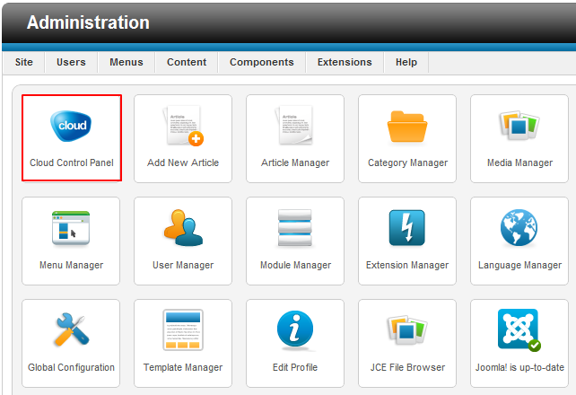
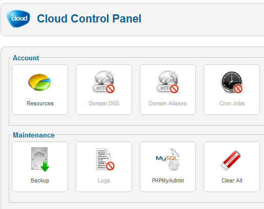
When Joomla 2.5 was released, we removed the CCP from the Joomla application and added those features to the Client Area, unifying account and application management tools. The result was the second version of the Cloud Control Panel, which you can see below.
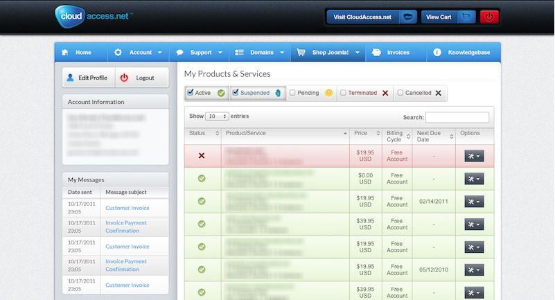
When we set out to completely redesign it, we knew it wouldn’t be an easy task. It's one of the most important products in our portfolio and it’s used by thousands of clients everyday. To ensure that the redesign was successful we went through several scrum sessions identifying mistakes we made in previous versions.
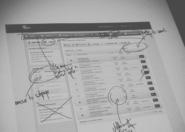
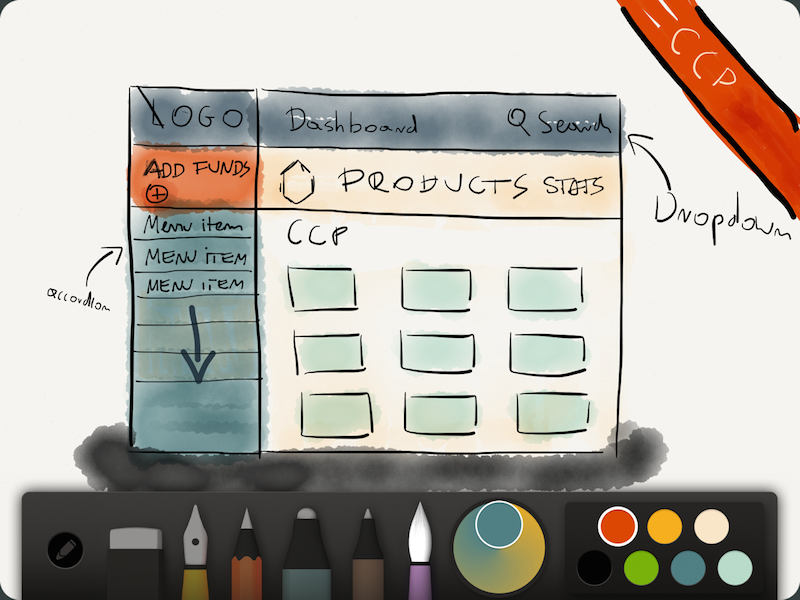
We mostly wanted to improve the way the customer navigated through his or her products. Some clients only have a few products and others have hundreds. We tried a several concepts before ending up with a solution that worked for everyone - a design where clients can segregate products by product type and locate specific products by using a dynamic search bar.
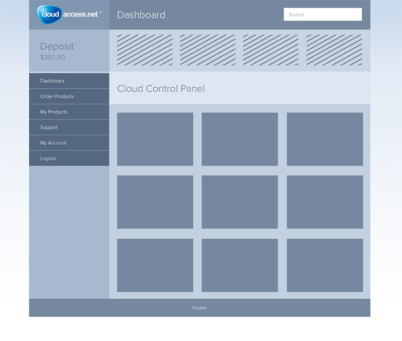
Then we created a digital wireframe based on the sketches. When the wireframe was ready, we uploaded it to our project management software where we created separate tasks, offered comments and feedback, and shared files between contributors. This process took a long time, especially for such an import part of our platform, and after many rounds of discussions with UI/UX experts, designers, coders, and programmers, we were ready to start the real design process.
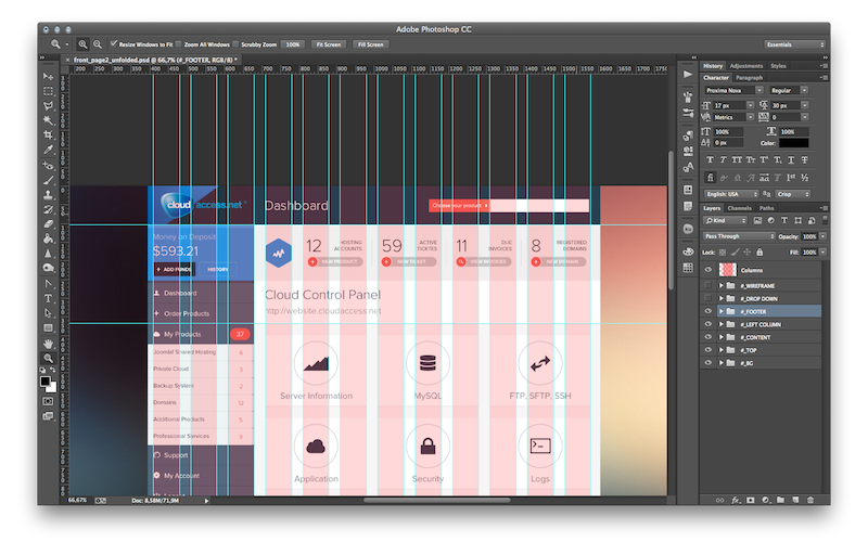
We decided to go with a flat, contemporary design and we removed textures, gradients, shadows and other elements to focus on simplicity. We used a saturated and bright color palette to highlight important elements, allowing our clients to easily recognize and interact with the important CCP features. We choose a color scheme that we liked so much we later used the same scheme when we redesigned our main company website. As a result, we now have brand and design uniformity across the entire platform.
We pretty much exclusively use Shape Tool in Adobe Photoshop when creating our graphics so all the layers are easily transferable to CSS. Another key part of our workflow was organization. When working on a large project, we ultimately ended up having 40+ PSD files and naming files consistently and organizing layers logically makes the coding work for front end developers much easier. And everyone likes a happy coder. When the main view was completed with a perfectly aligned layout, a carefully selected typography set, and complementary colors, our design team uploaded the main PSD file for our front-end developers.
Another important aspect we wanted to change was the way that customers ordered new products. Essentially, we wanted to make the experience of ordering a product as simple as possible, and we decided to divide the process into unique steps where the client could easily edit his or her order and browse through the cart with as few clicks as possible.
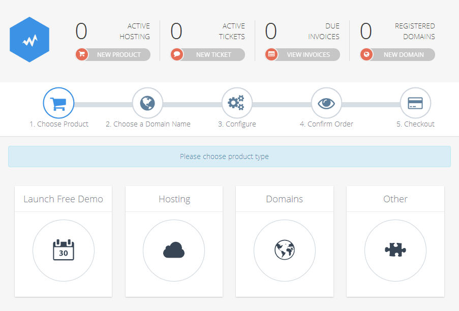
Our next challenge was to make the CCP experience the same for users on multiple devices. Users that use mobile devices to manage their products should have the exact same experience as users that browse the CCP on their desktops. Therefore, we made the new CCP completely responsive. If you want to learn more about the responsive web design we recommend reading Responsive Web Design written by Ethan Marcotte.
Last, but certainly not least, was optimization. To speed up the loading time we redrew all the raster icons in vectors and then generated font icons. As a result, all of our icons are fully scalable and look great at any resolution.
![]()
After a few final touches we prepared marketing materials including tutorials, promotional videos, a series of blog posts and social media announcements, and our product was ready to launch. Register today to see how easy it is to manage your Joomla! and WordPress applications using the CCP! We’re extremely proud of the end product and we hope you find the experience enjoyable, professional, and highly functional.
