Brand Manual
Welcome to the CloudAccess.net Brand Manual. This manual contains the main features of the CloudAccess.net brand and logo. It is a comprehensive presentation of the brand and its promotional potential.
The manual covers the configuration of the logo, the typography and color palette of the CloudAccess.net brand and other tips on how to use the brand and logo correctly.
Table of Contents
- CloudAccess.net Logo
- Area of Isolation
- Size and Minimum Size
- Color Variations
- Color Variations - Examples in Use
- Logo Misuse
- Logo Placement
- Colors
- Fonts
- Download Section
CloudAccess.net Logo
The main element of the CloudAccess.net logo is the “Cloud”. The “Cloud” is an indispensable part of the logo. The “Cloud” is more than just a graphical symbol. The “Cloud” is a kind of avatar, which is able to adapt to situational needs. It has also been used as a corporate mascot and our backup icon.

Area of Isolation
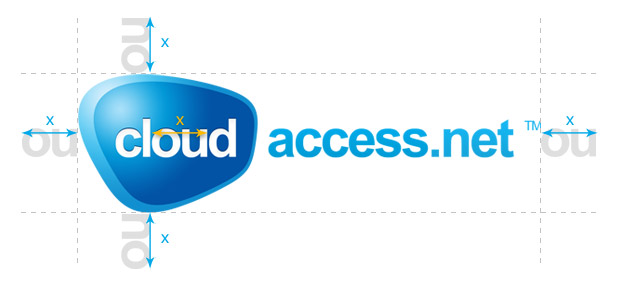
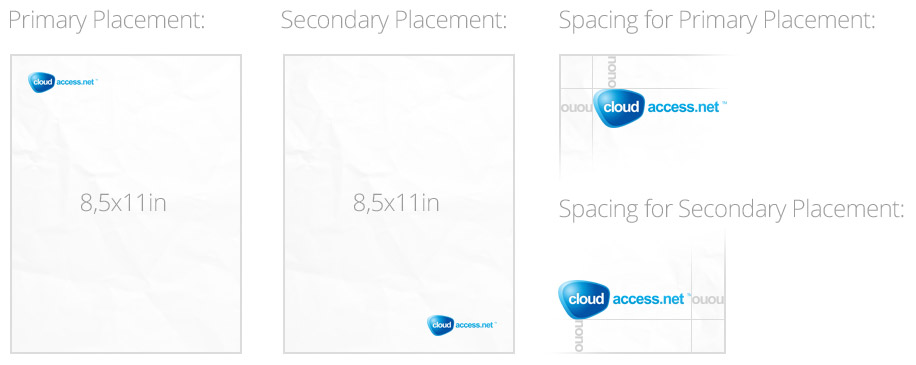
To maintain readability of the CloudAccess.net logo, always keep a minimum distance around the logo. This clear space isolates it from surrounding graphical elements such as other logos, pictures or backgrounds which can be distracting. The minimal distance that should be kept is very easy to determine. Use the width of the “ou” letters in the “Cloud” symbol. Maintain the minimal distance when the logo is enlarged or reduced.
Size and Minimum Size
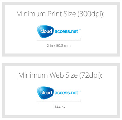
The size of the CloudAccess.net logo changes depending on the situation in which it is being used. The logo must be resized in such a way to maintain readability. If you use the logo you must adhere to the minimum print size and the minimum web size whch are indicated here.
The minimum width of this logo is 2 inch / 50.8 mm.
Color Variations
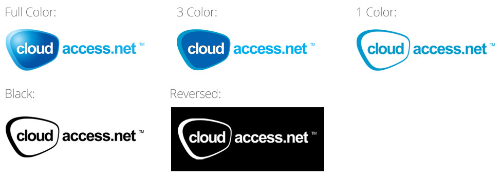
The CloudAccess.net logo has been prepared in several color themes to fit possible needs. The best background color for the logo is white. The “Full Color” logo should always be used online. The other versions are good in print from. The CloudAccess.net logo should be used in the color version whenever possible. The versions of the logo displayed below use a vector graphic form.
Color Variations - Examples in Use
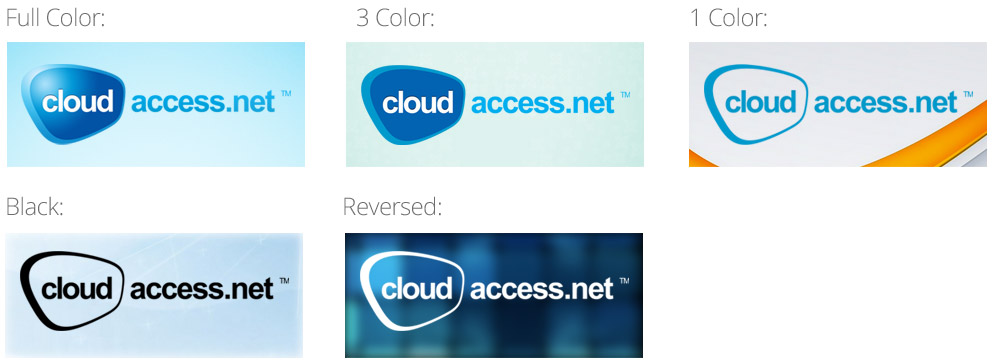
Below we have used all versions of the CloudAccess.net logo with different backgrounds. Be sure to maintain an adequate contrast level for each logo type.
Logo Misuse
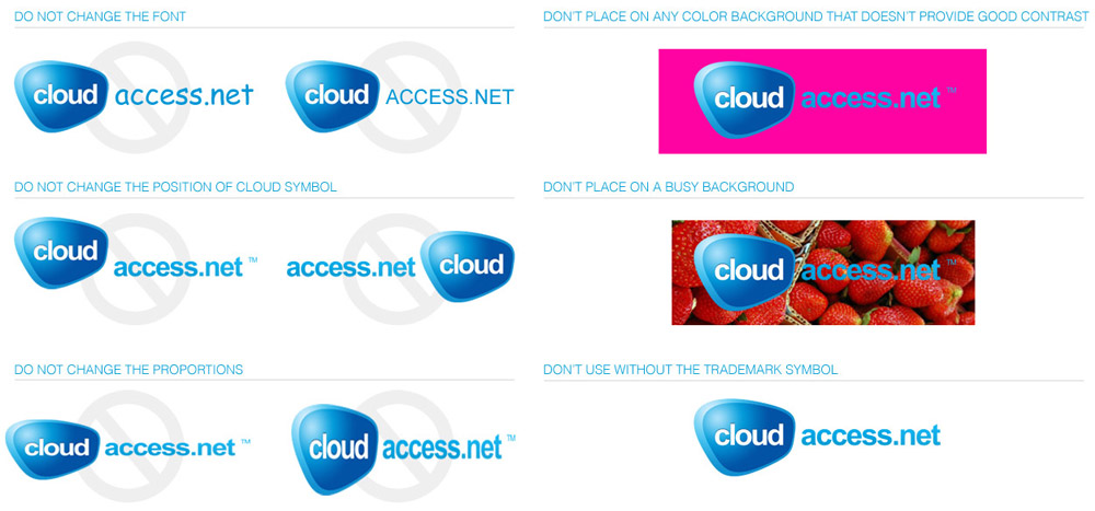
Improper use of the CloudAccess.net logo may change its message and efficiency. To make sure this doesn’t happen, we have prepared a couple of examples of how NOT to use the CloudAccess.net logo. If you’re still not sure what to avoid while using our logo, be sure to remember these rules:
• do not add or remove anything from the CloudAccess.net logo
• do not change the proportions
• do not remove the ™ symbol
Logo Placement
Whenever possible, the CloudAccess.net logo should be placed in the upper right corner of the webpage/page in full color, on a white background. Logo placement helps build CloudAccess.net brand awareness. On printed material like a letterhead, a business card or an envelope, double the distance of the letters “ou” around the edge. We have created two examples that illustrate this concept.
Colors
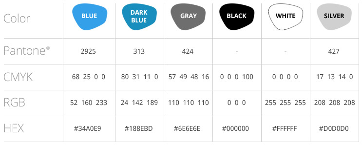
Color is a powerful form of communication and a base for creation of each brand. The color palette attached to this document is designed to stimulate creativity and to open up new possiblities of use. Thanks to the use of muted colors we can easily maintain harmony and consistency in all elements of the corporate visual identity.
Please note that some minimal color differences may occur when using them with various media (web or print). If you cannot use the PANTONE color, use the data from the table on the right to find the right equivalent.
Fonts
To help provide a consistent, unified look in the CloudAccess.net’s use of typography, the Proxima Nova typeface should be used for headings on all communications for CloudAccess.net products and services. For body text, we recommend using Helvetica Light.
If Helvetica Light is unavailable, we also recommend Arial and Georgia due to its high legibility and universal format. Georgia Italic should be limited to highlight a short quotation.
Georgia Italic should not be used for full paragraphs or entire pages of body text. Therefore, the CloudAccess.net website and comment sections should continue to use Helvetica Light.
Download Section
Download Cloudaccess Backgrounds

